I’m amazed to say that I got the People’s Choice prize at the Bath Open Art show which finished on Saturday 26th October (2024).


I’m amazed to say that I got the People’s Choice prize at the Bath Open Art show which finished on Saturday 26th October (2024).
My work Requiem for Oil has been selected for the Bath Open Art Prize Exhibition 2024. There are other pics of work in progress earlier in this blog.
Prize winners will be announced by judges Leonie Bradley and Karen Wallis on Friday 11th October, wish me luck!
The exhibition runs:
10th to 26th October
open 11am-5pm daily
at 44AD artspace, Bath BA1 1NN (this gallery is in the centre of Bath)
bathopenartprize.co.uk
fringeartsbath.co.uk
#BOAP2024
Thank you to organisers Fringe Arts Bath @fringeartsbath and the prize’s supporters for this opportunity: @Wessex_Area @thebellinnbath @studio44ad @minervaartshop

Poster artwork: Andrew Jenner, Sunday in the Park with George @the_dolliverer
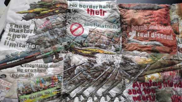
Post updated October 8th 2024. This is the final version of Requiem for Oil, 270 x 165 cm, mixed textiles, lino-print, transfer & other print, stamping, ink, fabric paint, embroider and machine stitch. I delivered the quilt to 44AD gallery in Bath yesterday and it will be on display from Thursday 10th October as part of the Bath OPen Art Prize Exhibition 2024.

Art Brut (‘raw art’ or for the cupboard) I expect. But more influenced by the COBRA (Copenhagen, Brussels, Amsterdam) anti-formalism movement which grew out of Dada and the disaster of WW2.
If you’re in Amsterdam be sure to visit Cobra Museum in Amstelveen.
Requiem for Oil, artist’s book, 2016 (I updated the title)
I use a free font throughout the work, Action of the Time Now by Galdino Otten
The Oil quilt consists of four panels made up of about 80 squares of 20 x 20 cm, printed, painted, drawn, embellished, stitched and embroidered in various ways. I’m finding it hard to finish, the desire to add more detail is strong but almost certainly misguided. Better to work on another piece I think.
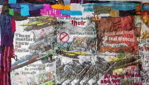
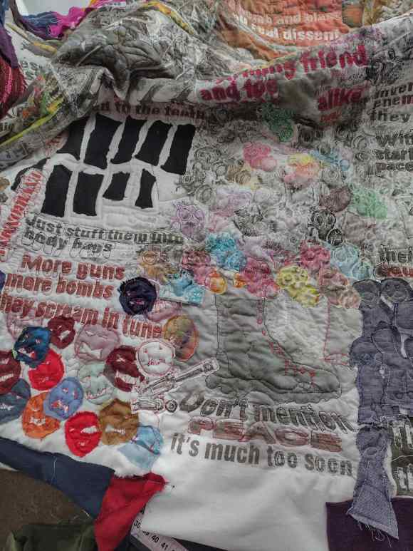
This detail is from the upper left of the second panel, it feels topical. The quilt as a whole seems to be a polemic.

This second detail is from same panel, lower right.
Most of this was complete months ago, just doing borders now. If the text seems topical, October 31st 2023, it’s because the people in charge in the west never stop bombing some poor brown folk somewhere in West Asia, Africa or Central America, or anywhere else they fancy.
Most of the work for this quilt was complete months ago but current events are spurring me to finish. I’m mainly adding borders at the moment but there will be more work after that, pens and stitch and some discharge paste to remove colour in a few places. It can be hard to know when to stop! The original poem was written long ago, it’s on this site in artist’s book form.
Anti-art was a term adopted by the COBRA group of artists who formed in Copenhagen, Brussels and Amsterdam in 1945, as WW2 in Europe ended, a reaction to the horrors just experienced. Some of their work is at the Cobra Museum of Modern Art in Amsterdam, well worth a visit if you are in that great city, I found it inspiring. The label anti-art for works that end up in art galleries is a good place to start a discussion about what is art (yawn) because as soon as a gallery is involved or the works are sold then it must become art of some sort. Perhaps if they had kept the work to themselves the group would have been labelled as producers of Art Brut, a form which doesn’t seek public approval or sales, generally.
There is a documentary currently (October 2023) on BBC iPlayer about the Dada movement, closely associated with anti-art.
Each square is a little more than 20 x 20cm and there are more than 70 to make up four quilt panels. Quite a few have been made two or more times and as they are mono-printed and/or stamped as well as inkjet printed, sometimes drawn on, each one is a unique piece. They are also quilted and stitched, sometimes embroidered and that is also unique to each one. I’m not making a second quilt (yet) just want some squares for display and sale.

These are low-res scans, hopefully the originals look better. All work in progress, more printing and stitching isn’t ruled out. And borders have to be added.
I’ve used a free font (non-commercial) all through this work, called Action of the Time New™ by Galdino Otten, although in most places it won’t be recognisable as I have distorted the text, over-drawn, over-stitched and over-printed almost everywhere. It’s a great font family.
This is an article by Michael Welton, mainly about a gallery show in Ottowa, Anthropocene. But it also looks at earlier work by Burtynsky, et al. I just came across this trailer for the recently released film, Anthropocene: The Human Epoch.

image by Edward Burtynsky

